Share
For the last years, thousands of refugees and migrants from conflict-affected countries have tried to reach Europe in their attempt to find a better life. According to UNHCR, more than 1.2 million people arrived by sea from January 2015 to June 2016, whereas in the same period of time more than 6,700 people died or were missing from their pursuit to cross the Mediterranean Sea.
Since the beginning of the crisis, the Humanitarian Data Exchange (HDX) has been engaging with partner organisations (international organisations and NGOs) to bring together relevant datasets that could be used by humanitarians and policy makers to uncover new insights about the crisis.
HDX teamed up with Statistics Without Borders (SWB) and NetHope to develop a visualization that could maximize the value of the data being shared through HDX about this crisis.
This visualization was developed in part thanks to the kind support of Tableau and The Tableau Foundation.
Data Used
The following datasets are used in the visualization:
- European Refugee Response data with details about the organizations providing assistance to migrants (source: Internews);
- Mediterranean Sea Arrivals in 2015 data about monthly arrivals to the coast and islands of Greece, Italy, and Spain between January 2014 and December 2015 (source: UNHCR);
- Daily Estimated Arrivals data about migrant arrivals to Greek islands, Macedonia, Croatia, Hungary, Slovenia, and Austria as well as departures to the Greek mainland (source: UNHCR);
- Monthly Sea Arrivals to Italy and Malta data about the arrivals of refugees collected in near real-time from UNHCR’s API.
Note that as stated in UNHCR website, arrivals figures are subject to adjustment and should not be considered final. Therefore, it may be possible that figures used at the time of this analysis are different from the ones published today by UNHCR.
Highlights of the Visualization
There is much to explore in the Tableau workbook that was created. Each visualization displays the most recent time period available at the time of the analysis. For additional details, hover on ![]() on the bottom right of the visualizations. Some highlights are described below.
on the bottom right of the visualizations. Some highlights are described below.
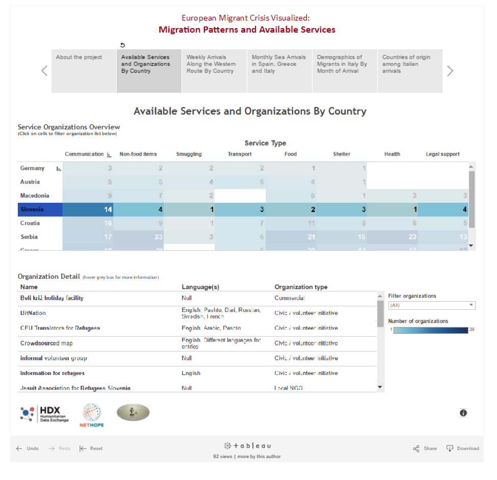
- Available Services by Country
The list of country-specific services and organizations are accessible by clicking on the cells in the heatmap. Detailed information on the organization is also available in the grey box under the last column. To put the number of services into perspective, the total number of arrivals since October 2015 can be seen when you hover on the cells.
The example below shows the filter for the 14 organizations in Slovenia. At the time of the analysis, Germany and Austria have fewer services reported. This view helps to identify low-resource services for each country relative to the total number of migrants.

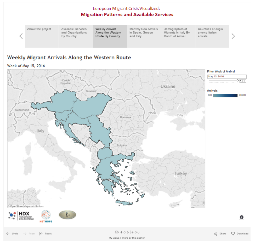
- Migration Patterns over Time
To help in planning and management of the crisis, a series of migration patterns are also available. These include:
- Weekly arrivals along the western route. By tracking the number of migrants, shifts in routes could be detected.
- Trends in the number of monthly sea arrivals in Greece, Italy and Spain by region. At the time of the analysis, the ports of Lesvos, Sicily and Andalusia have the greatest number of migrants, while Greece have had the greatest number of migrants due to its proximity to Turkey.
- Migration trends into Italy since January 2014 by demographics and country of origin. Needs for services may vary depending on these factors. The present visualization shows that migrants are mostly male and the majority are from Africa. The top three countries of origin arriving in Italy from January 2014 to June 2016 are Eritrea (72K), Syria (50K), and Nigeria (29K), and many more unaccompanied minors arrived in Italy than accompanied minors.
- Trends in the countries of origin for Italy overall and for each migrant group. This may be helpful to monitor unexpected shifts in migration.
Limitations
The visualizations have some key limitations that impact their interpretation:
- The original intent of the weekly arrivals visualization was to estimate the number of migrants still present in a given country. However, the underlying dataset is limited in that the country from which the migrants originated is not known. Therefore, the team was unable to estimate the number of migrants that leave a country. Attempts to do so produced unexplainable results (e.g. negative migrant numbers).
- The Monthly Arrivals by Sea visualization uses the Athens location to denote ‘other islands’.
Even with these limitations, the team believes these visualizations could provide key high-level insights that can be used to help policy makers to make decisions and contribute to the welfare of refugees and migrants.
The collaboration between HDX and SWB included the following team members: Ella Temprosa, Brad Kenny, Jon MacMillan, Timur Mukhtarov, and Michiko Wolcott.
We welcome your feedback. Please share comments with us through hdx.feedback@gmail.com.