Share
The Centre spoke with Sophie Chotard, a Deputy Global Programme Manager with the Integrated Food Security Phase Classification (IPC), based in Rome. IPC is a multi-partner initiative for improving food security and nutrition analysis and decision-making, hosted by the Food and Agriculture Organization and founded in 2004. We discussed how data guides decisions on where urgent action is needed, the implications of the Ukraine war on IPC projections and the challenges with using humanitarian data.
This interview was conducted by the Centre team. It has been edited and condensed for clarity.
Can you give us an overview of IPC?
IPC provides information on the food security and nutrition situation in about 30 countries to inform decisions, whether at the global level (for instance, by donors on resource allocation) or at the country level (on programming, for example). We provide a common global scale to classify the food security and nutrition situation. Stakeholders use the IPC protocols to come up with the analysis of the situation, and it’s kind of a ‘thermometer’ to give a sense of the temperature, how bad the situation is, on a scale of one to five.
Tell us about IPC’s methods.
The multi-partner technical consensus is unique. We bring all the relevant stakeholders, governments, UN agencies, NGOs and technical agencies at the country level together. They bring their data and work together for a few days to produce a joint analysis based on the technical consensus of the experts in the room. The process promotes collective ownership and better-coordinated response. Decision makers have one common source of information to make their decisions.
We identify hotspots – the major food crises that are ongoing or expected to emerge in the next few months. We provide forecasts, not just a snapshot of the current situation. We’re able to guide decisions on where urgent action is needed.
There are six key questions that we answer: How severe is the situation? How many people are food insecure or malnourished? Where are they? Why are they in those situations? Who are they? What is their forecast for food insecurity in the coming months? It’s a common global scale so all countries are using the same protocols, the same indicators with the same thresholds. It provides comparability within and across countries, whether within a region or across the globe, and across time as well. It allows us to look at trends and how the situation is evolving.
What is the relationship between IPC and Cadre Harmonisé?
Cadre Harmonisé (CH) is a similar tool to IPC that covers about 18 countries in West Africa and the Sahel. We’ve been working for years now with Cadre Harmonisé partners to sync our tools and processes to the point that findings from a Cadre Harmonisé analysis are absolutely comparable to those from an IPC analysis. Based on that, last year we developed and launched joint mapping tools. There is now a map of the world which shows not only the phase classifications from IPC countries but also from West Africa and the Sahel using Cadre Harmonisé data. Together it is about 45 countries.
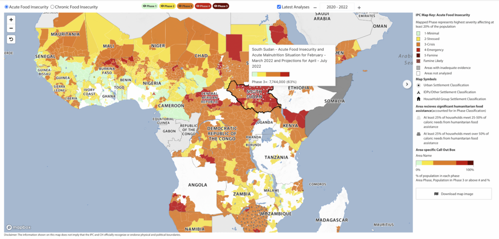
Someone can use our map as a quick overview of the most food insecure locations in the world and quickly understand where the key issues are. It also shows trends as the situation changes over time. Another function users like is you can remove some of the phases, for example if you only want to see the most severely affected areas. You can also see details about each country, such as the IPC/CH classification at the sub-national level and the proportion of people in different phases. We have gotten quite a lot of positive feedback overall and, especially at the global level, decision makers are very happy to have this consolidated picture. It helps with prioritization.
How are secondary impacts from the war in Ukraine affecting IPC estimates?
The Ukraine crisis is expected to have an impact on the food security situation in a wide range of countries. We are particularly concerned about the countries that are already facing major food crises. To this end, we have developed technical guidance for IPC analysts so they can incorporate the impacts of the crisis on IPC acute food insecurity classifications.
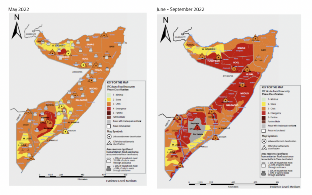
IPC analyses that have been conducted recently already take these developments into account. For example, in the case of Somalia, which is dependent on imports from Ukraine and the Russian Federation for over 90 percent of its wheat consumption, the production and supply chain impact of the Ukraine crisis is expected to put further upward pressure on food prices, thereby threatening the food security of millions across Somalia, especially those who already spend a disproportionately large amount of their income on food. The country now faces an increased risk of famine.
[According to the latest IPC projection, approximately 7.1 million people across Somalia will likely experience high levels of acute food insecurity (IPC Phase 3 or above) between June and September 2022, including 4.7 million facing Crisis (IPC Phase 3), 2.1 million people facing Emergency (IPC Phase 4) and more than 213,000 facing Catastrophe (IPC Phase 5).]
What kind of new technologies support your work?
We’ve been working on how to leverage innovations like artificial intelligence to support IPC processes and analysis at the country level. We’ve established a working group with global IPC partners, UN agencies, NGOs, technical agencies, and technology companies. Some innovations could support data management and data processing. Country stakeholders bring their data together to conduct the analysis following the IPC protocol and it’s a large amount of data. With APIs and web scraping, there are more efficient ways to gather and consolidate data and visualize it in ways that make it easier for analysts to do their work.
How are you working with HDX?
Our objective is to contribute to improve decisions, which means IPC data must be easy to find and use. HDX makes the data more accessible and the more accessible it is, the better for decision making. We developed an IPC organization page on HDX providing access to 30 datasets on the acute food insecurity scale for the countries where we are operational. In the medium to long term, we hope to share data on the other scales (acute malnutrition and chronic food insecurity) and improve our visualizations on HDX. The HDX team has also included IPC data in the COVID-19 Data Explorer.
“While we are a data provider, our partners who conduct analysis and even our team at the global level use the HDX platform to identify, gather and consolidate data on the countries that they are doing analysis on. It’s a two-way relationship.”
-Sophie Chotard, Deputy Global Programme Manager, IPC
What are some of the challenges you face when working with humanitarian data?
We don’t collect primary data ourselves. We often face data gaps, whether due to access constraints because of ongoing insecurity or conflict, or weather hazards. Sometimes it’s just a question of funding capacity and resources.
Another challenge is that the situation on the ground keeps changing. That’s not new. With COVID-19 and other developments (conflicts, for example), it seems to be changing even faster now. At the same time, there is more data and more near real-time data which is hard to keep up with. It’s a good development, but challenging. This is where the innovations come in.
We also need to be aware of the potential for duplication. We should make sure that it’s not too confusing for decision makers who obviously need to reconcile all this data. This is where HDX adds value, because it brings all the data together into one platform, regardless of the source.
What’s next for IPC?
We’ve been working on a new, complementary tool to our joint mapping called the IPC-CH Dashboard, which we just launched, in collaboration with our partners from the Cadre Harmonisé initiative. It provides consolidated IPC and Cadre Harmonisé numbers of food insecure people at the global level in near real time, disaggregated by phase. It is a simple dashboard for now, but the idea is to progressively expand its functions and features, allowing for disaggregation by region or a selected set of countries and graphs of trends.
What triggered it is we are a major contributor to the Global Report on Food Crises. IPC and Cadre Harmonisé provide 80 percent of the data for the report. It is published once a year, usually in April, then updated in September. In between, decision makers, agencies and even the media need to know how many people are food insecure in the world today. Instead of them having to calculate that manually, checking every single country analysis and adding the numbers, they can have updated figures in just one click.
What do you love about what you do?
Working at the global level has a strategic reach. I feel that I’m contributing indirectly to ensuring that the right type of response is implemented in the right place at the right time for the people who most need it. That, for me, is really the end game. The partnership element of IPC is also very powerful – when you can bring 20 partners around the table to agree on the picture of the situation and speak with a common voice. I find this quite rewarding. I’m also privileged to work with a wonderful, competent and very dedicated team.