Raster & Vector Data
There are two main types of spatial data: vector and raster data. Maps are often made up of layers of both types of data. In this video, we will go over the similarities and differences between vector and raster datasets, and in the accompanying tutorial, you will learn how to work with both in QGIS.
Tutorial
Let’s start by opening the project that you saved at the end of Module 1. This contains most of the data you need to start this session. If you have not completed the practical exercise for Module 1, please do so before proceeding.
In Module 1, we had opened three vector files: a point file for settlements, a line file with roads and a polygon file with administrative boundaries.
- Open the project that you saved at the end of Module 1. (This should be stored within your Maps folder)
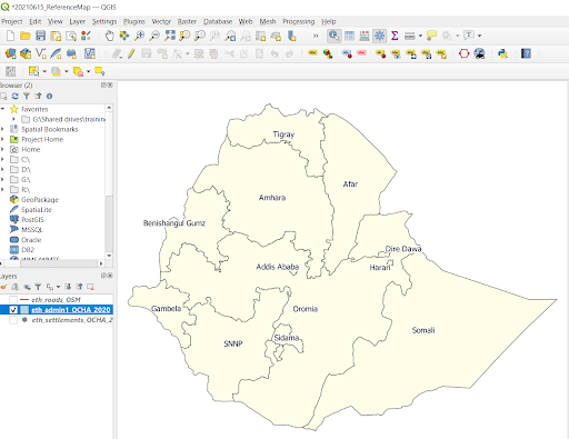
- Turn off the display of all layers (unclick them in the “Layers” list) then turn on the display of your polygon layer – Admin 1.
- Right click on your Admin 1 layer and select Zoom to Layer. This option zooms to the full extent of the chosen dataset, and it is useful to visualise a dataset in its entirety.
Identify features
We will now use the identify features tool to discover what information is associated with each of the Admin 1 areas.
- Click on the Identify Features tool in the top bar, then click on any of the Admin 1 areas
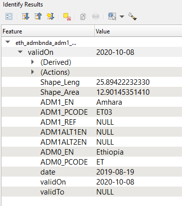
In the “Identify Results” window that opens on the right, you should see a summary of the attributes associated with this feature. This will look something like the image below:

This is all the information available for that area of land – the Admin 1 shape that you clicked on. Take a minute to see what information is included. The left-side “Feature” column has a list of the information categories (the attributes) available for this dataset and the right-side column has the associated value. For this dataset, the most useful information is name and p-code for Admin 1.
What is a P-code:
P-codes are unique geographic (geo) identification codes, represented by combinations of letters and/or numbers to identify a specific location or feature on a map or within a database. For specific place, point, or positional locations, the geo-codes have come into common usage as P-codes (abbreviated for Place-code). These terms can be essentially interchangeable as long as one recognizes the focus on “position or place” for P-codes. They are also used to provide unique reference codes to refer to settlements or administrative boundaries in other datasets.” (Source)
Attribute Tables
Each feature in a vector data file has both geographic information as well as other qualitative and quantitative attributes associated with it. Using the identify features tool, we were able to explore this data for one feature, in this case the shape we clicked on. To see all the qualitative and quantitative information available for every feature, we have to open the attribute table.
This non-spatial information is stored in a table called “the attribute table.” In an attribute table, each row represents a different feature, which are the different Kililochs in the dataset. Each column contains the types of information available for each feature.
- Right click on the Admin 1 layer in the “Layers” list and select Open Attribute Table.
- Click in the number next to a row to select it. When you;ve selected it, it will turn blue on the table. Move the attribute table so that you can visualise the shapes on the map: can you see a shape highlighted in yellow? That is the shape that is associated with the information highlighted in the table.
You can also sort the attributes. Click on the field heading ADM1_EN to sort the names alphabetically.
Let’s have another look at the table. How many Admin 1 Regional States, or Kililochs, are there in Ethiopia? And are population values for each Regional State available in this dataset?
Remember, each row in the attribute table represents a different feature. In order to calculate the number of Admin 1 regional states in Ethiopia, we can simply verify the number of rows in this table, which is displated at the top of the table.

Next, because each column represents a different category of information available for that shape, to answer the second question, we can simply scroll left and right looking for a column that contains population information.
…And there isn’t one!
Before we continue, make sure none of the shapes are selected. You can click on the “Deselect” button on the “Attribute table” to deselect all features for that particular layer.

If one of your shapes is highlighted in red, that means you are still visualising its attributes in the bottom right, “Identify Results” window. You can click on a white section of the map canvas to clear that selection as well.
Labeling
It is often useful to label features based on one of their attributes. We will label the Admin 1 Regional States using their name attribute.
- Right click on your Admin 1 layer in the “Layers” list and select Properties. The Properties menu is something that we will use frequently, as it allows us to (among many other things) both visualise and manipulate the appearance of our dataset.
- Click on “Labels”
- From the drop down list that currently says “No labels” select Single labels
- In the drop-down for Value select ADM1_EN then click “Apply”
You should now see the labels on the map, but they may not be very clear as they overlap with boundary lines. There are many formatting options in the menus below that we encourage you to experiment with but two of the most basic are font type and size. Play around with the type and size until you get something that you like.
We will also add a buffer to make the labels easier to see.
- Click on “Buffer”, check the option, then click “Apply.” It is not necessary to change any of the parameters, but you can do so to experiment and until you are happy.
Symbology By Attributes
There are three main symbology strategies for visualising vector data:
- Single symbol: All features have the same symbol/colour. This is used when you do not want to emphasise any particular difference between features of the same dataset. For example, all major airports could be represented with the same symbol, in the same colour and size.
- Graduated symbology: Features of a dataset are ranked according to one of their numeric attribute fields, and symbols vary in size or colour according to that rank. This would be useful when symbolising a layer representing population by administrative areas: we would rank our administrative areas by their population, and colour each shape from light (lower population values) to dark (higher population values) using a single colour palette.
- Categorized symbology: Features of a dataset are symbolised differently according to one of their categorical fields. This strategy could be used for road types, or for distinguishing schools, from hospitals, banks, restaurants etc.
Admin 1
We will now experiment changing the symbology for the Admin 1 areas. First we will try assigning a unique colour to each admin area.
- In the Layer Properties window click on “Symbology”
- From the drop down list that currently says Single symbol select Categorized
- Click on the drop down next to Value and select ADM1_EN
- Click “Classify” then click “Apply”.
Each Admin 1 area now has a unique colour associated with it. This makes the areas easier to distinguish, especially for more confusing boundaries such as SNNP, which has an additional smaller area to the east that falls under the same administration.
If you wish to change any of the colours you can do so by accessing the Symbology menu in the Properties section, and by clicking the square colour symbol to the left of a particular Regional State. Always click “Apply” to see your changes on the map.
Before we continue we will change the symbology back to a single symbol so that we can see the changes we make to other layers more clearly.
- Change the style from Categorized to Single symbol then, under the “Fill” section, select Simple Fill. This opens up the opportunity to choose both a fill colour and style, as well as an outline colour and style.
- Move to “Fill colour” and choose a colour. A pale colour would be best as we will use the administrative areas as background information for the roads and settlement layers that we will work with next. You can also change the colour of the borders by clicking on the colour bar next to the “Stroke colour” option. You can use a dark gray for your Admin 1 borders.
- Click “Apply” to see your changes, and when you are happy with your colour choice, click “OK” to close the layer’s Properties window.

Settlements
Now let’s explore the settlements layer in more detail.
- Turn on the display of the settlements layer and make sure this is drawn above the Admin 1 layer so that you can see the settlement points clearly. To do so, select the layer in the “Layers” list and drag and drop it on top of the Admin 1 layer.
Notice that there are lots of settlements, and they all look the same – regardless of whether they are a significant city or small village. This is not very useful. Let us have a look at the attributes associated with this layer to help us better differentiate between settlement types.
- Right click on the settlements layer in the “Layers” list and select Open Attribute Table
You will see the names of the settlements (T_NAME) as well as a column called ‘T_Status’. This is a potentially useful field. The potential values for this categorical variable are ‘Capital City’, ‘Regional Capital’, ‘Zonal Capital’, ‘Wereda Capital’ and null. We can classify the settlements based on these settlement types.
- Close the Attribute Table
- Right click on the settlements layer to open the layer’s Properties
- Click on Symbology
- Change the dropdown from Single symbol to Categorized
- Select the Value to be T_status.
- Click classify
- Click “Apply”
Now the different settlements are coloured based on their type but this doesn’t necessarily give us any additional information or make our map easier to read. Another option would be to change the size of the settlement points.
- Close the Attribute Table
- Right click on the settlements layer to open the layer’s Properties
- Click on Symbology
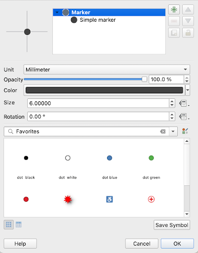
- Click on the point symbol next to “Capital City” to open the symbol selector. Change the colour to a dark grey and change the size (6.0). Repeat this step for Regional Capital (4.5), Zonal Capital (3) and Wereda Capital (1.5).
- Click Apply.

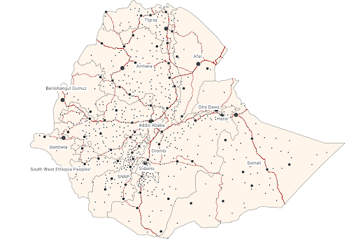
Now you will have different sized points with more significant settlements shown as larger points and the less significant, administrative level three capitals shown as smaller points.
Roads
The final vector layer we will explore is the one representing roads.
- Turn on the display of the roads layer
- If necessary, move this so that it is drawn above the Admin 1 layer and below the settlements layer. It may take a few minutes to draw, it is a big layer! It has a lot of roads, including smaller, more residential ones.
- Click on the roads layer in the “Layers” list to activate it then use the “Identify Features” tool to click on any section of road.
In the “Identify Results” window, you will see many attributes associated with the roads, although for most sections of roads many fields have NULL values. The most useful attribute here is the nlt class, which tells us the type of roads. We will again explore changing symbology based on an attribute, this time to differentiate major roads from less important ones, and therefore differentiating by their class.
- Right click on the roads layer to open thelayer’s Properties
- Change the Symbology type from Single symbol to Categorized
- Change the “Value” to nltclass
- Click Classify
Before we choose symbols for the different classes, we will merge together each type of road with the link road associated with it (e.g. motorway and motorway_link).
- Click on motorway in the list of values, then hold down the Ctrl key on your keyboard and click on the value for motorway_link, then right click and select Merge Categories
- Repeat this step to merge:
- primary with primary_link
- secondary with secondary_link
- tertiary with tertiary_link
- trunk with trunk_link
- roads with unclassified
We are now ready to assign symbols to each of the classes. We will apply hierarchy to the roads showing so that more important roads stand out more (e.g. wider line widths or bolder colours).. You can order the road types as in the hierarchy here below by selecting a road type and dragging it above or below another category.
The roads are ranked most to least important as follows:
- motorway
- trunk
- primary
- secondary
- tertiary
- unclassified
- tracks
Click on the line symbol next to “Motorway” to open the symbol selector. Click on “Simple Line” and change the colour to something dark and bold e.g. black or red and make the line wider e.g. width 0.8
Repeat these steps gradually making roads thinner and lighter. [Hint: Avoid widths below 0.15mm as these may be difficult to see]. For this national reference map, it is not essential to distinguish between all different types of roads, nor is it to visualise them all. You can pick the same bold colour for the first three categories, and make the lines a little thinner for “Trunk” (0.6) and “Primary Road” (0.4).
Unclick the other road types, so that only major roads remain visible. Click on “Apply” and “OK.”

Symbolising Rasters
The way location and attributes are stored within raster datasets is different and changes the way we explore, symbolise and analyse the data. In this final example, we will explore the Facebook population data that you downloaded during Module 1. We need to begin by adding this layer to our project.
- Add the Facebook population data to the map. This should be stored within your “2_Active” data folder, within a subfolder for population. It can be added to the map either by clicking and dragging the .tiff file from the File Explorer or by adding it from the Browser pane within QGIS.
Zoom in until you see the structure of raster data. You should begin to see the square pixels that form the data. Each of these pixels is approximately 30x30m and has a value that represents the number of people estimated to live within that 30x30m area.
- Use the Identify Features tool to click on one of the pixels and discover the population count associated with it.
Notice that unlike the vector (feature) data we worked with earlier there is only one attribute associated with each pixel. Notice also how this dataset gives us an immediate idea of where the majority of the population lives in Ethiopia.
However, the data is not currently displayed in a way that helps us interpret the data values. In this final part of the exercise we will change the symbology to better show variation in the data.
- Zoom to the extent of the full country (you can right click on the Admin 1 dataset, and select Zoom to Layer)
- Right click on your population layer and select Properties.
- In the “Properties” window click on Symbology.
- Change the Render type to Singleband pseudocolor, then click “Apply”
You should immediately see more variation within the data, and be able to clearly identify the capital Addis Ababa by its dense population, now coloured . We will now explore how changing some of the symbology options changes the appearance of the map.
- Experiment changing the “Mode” to Quantile, then click “Apply” (Quantile distributes the data so approximately the same number of pixels fall in each class, in each colour)
- Now change the “Mode” to Equal Interval and click “Apply” (Equal Interval makes the gap in values equal between classes)
Both modes can be useful depending on the data you are working with. It is, however, often useful to manually set the number of classes and select the breaks you want between classes that you want.
To change the number of classes to five. To manually edit the breaks between classes:
- Double click on the first value listed under “Value” then type 5.
- Repeat this for the remaining classes using values of 100, 1000, 2000 and leave the final category as the maximum value already listed. Then click Apply
You are free to experiment with different colour ramps, number of classes and break values to find symbology that you think best shows the data. Once you are happy with your choice of symbology click OK to close the “Properties” window.
Add a basemap
As a final step in this module, we will add a basemap to our workspace. A basemap adds geographic context to our data – but it is not data itself. We could not select a single city or a single road on a basemap in the way we do with the data we have added so far.
- In your browser panel, search the element called “XYZ Tiles” and double click (or drag and drop into the Layers panel) the OpenStreetMap basemap
- Make sure the basemap is at the bottom of all your layers in the “Layers” panel, so that it does not hide any of the other datasets.
Before closing, make sure to click save!
Summary
This practical exercise has provided the opportunity to explore a variety of attributes associated with different types of data and demonstrated how these are useful for understanding features, making maps more useful by changing symbology using attributes and labelling features to aid interpretation. In module 5 you will learn more about the importance of data attributes when undertaking data analysis.