Share
An enthusiastic group of 30 Deloitte data scientists, designers, humanitarians, and project managers spent an action-packed day working alongside the Humanitarian Data Exchange (HDX) team in June. The effort was part of Deloitte’s Impact Day when staff volunteer on projects they care about. The goal was to improve the way that community survey results are visualized.
Beginning with an understanding of HDX’s target audience, we aimed to make the most important survey insights impossible to miss. We explored ways to automate some of the up-front data structuring to make the transformation into visualizations more seamless. We also looked at how to made the underlying map — a critical feature in observing needs in a crisis — more interactive.
.@Deloitte #HDXImpactDay is off to a great start and #dataviz creation is underway! pic.twitter.com/c7lBtE2vUF
— HDX (@humdata) June 9, 2017
Four breakout teams and HDX advisors spread across six cities focused on one central challenge: how to understand the needs of affected people in a crisis and whether humanitarian assistance was having an impact.
Community perception surveys are increasingly administered to people impacted by disaster events. The data collected from these surveys are often shared through the HDX platform. The survey results offer critical insight about community needs for decision makers. However, moving the data from collection to use can often be slow and challenging, leading us to ask: how can we transform this data into insightful visualizations that clearly communicate respondents’ perspectives?
Using Nepal and Tanzania survey data that the HDX team had previously visualized (here and here), Deloitte staff applied skills gained from working with client data to explore new ways of visualizing the survey data. In parallel, a design-focused team helped to prioritize specific audiences and survey questions.
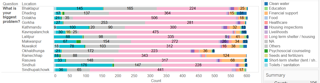 Long-term shelter stood out as the dominant need across regions of Nepal following the April 2015 earthquake in this Tableau visualization. Created by New York City-based Deloitte team on Impact Day.
From the outset we were guided by a number of criteria and constraints that the HDX team provided. For instance, approaches to data transformation and visualization would need to be as repeatable as possible so that they could be reused on other survey data with little customization, even if survey questions varied from one survey to the next.
Four additional design considerations and learnings surfaced over the course of the day that are applicable in many data visualization contexts beyond the specific data sets we worked with, including:
- Begin by understanding your target audience: We recognized that determining which information in a survey matters most depends largely on who you ask. Open data platforms provide valuable data to a variety of users, in this case humanitarian organizations, donors, researchers, journalists, and countless others. But, of those audiences, the HDX team wanted to focus on senior-level decision makers in humanitarian organizations, enabling them to make timely, informed choices on the scale and scope of humanitarian aid to deploy. That became the “persona” that we based our design decisions upon.
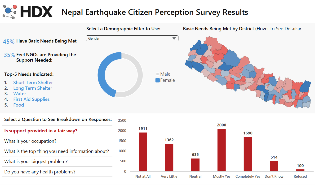
- Make the most important insights impossible to miss: This manifested in two different ways across the teams. Two teams collaborated on a dashboard that would put the most important survey responses (for the senior audience) front and center. Senior leaders would mainly want to know whether the survey was representative of the regional population, and if certain needs skewed towards specific demographic groups. Demographic features of survey respondents, while a priority to other audiences, were secondary for senior leaders, who would mainly want to know whether the survey was representative of the regional population and if certain needs skewed towards specific demographic groups. Consequently, two priority demographic features–gender and age–were included, but in a less prominent part of the dashboard. Two other teams experimented with visualizing different survey questions to see if responses across other questions were particularly illuminating, so that the most surprising survey results could also be prioritized.
 Wireframe created by Duncan Pregnall, part of the DC-based Deloitte team on Impact Day.
- Decreasing manual data cleanup means more time to surface and showcase insights: We recognized the HDX team could save time through a data transformation script that codes survey questions and responses into standardized question types (e.g., coded as ‘demographic’ for demographic related questions). This way, when they are pulled into a program like Tableau they can automatically be visualized. HDX could offer a consistent set of visualizations even when the survey questions vary from crisis to crisis.
- Make the map as interactive as possible: The severity of a crisis can vary widely throughout a region, and conditions are constantly changing. In one part of a region the need for shelter will top respondents’ list of most pressing needs, whereas elsewhere it may be food. The map is a critical feature in visualizations of humanitarian data. In reviewing the HDX team’s reusable scripts for survey visualizations, the Deloitte team recognized an opportunity to build greater interactivity between survey questions and how responses populated a map, adding a level of nuance that senior leaders would need to inform where additional aid would be distributed.
By the end of Impact Day, the teams had documented key design choices for how HDX visualizes survey results (e.g., target population, key demographic features, and a specialized approach for protecting survey respondents’ privacy). We created a number of deliverables, including:
- A data transformation script to streamline how data is prepared for visualization;
- A wireframe for a survey response dashboard;
- A design library of various visualization options for common survey questions;
- And a prototype for greater interactivity between survey responses and the map in the visualization.
While we accomplished a lot for a single day, we see many more opportunities for simplifying the process of how humanitarian survey data is visualized on HDX and elevating the level of insight communicated to senior decision makers.
Beyond the tangible outputs of the day, this collaboration offered a unique chance for our Deloitte team to apply the skills we use every day to the humanitarian context. Natalia Ochoa, one of my Deloitte co-organizers, shared:
“I was born and raised in a developing country, and have witnessed the suffering and tragedy that war and natural disasters can cause. It has been amazing to be able to use my analytical skills to help improve the response to humanitarian crises.”
Natalia was one of many in the group, myself included, who ended the day inspired to continue contributing to humanitarian efforts.