Share
Prior to starting my fellowship with the Centre, I had a vague understanding of how the humanitarian sector collected and shared data. In the process of learning, I came across so many acronyms that I had to keep a Google doc open during readings and research. The system is complex, reflected not only by my acronym list but also by the variety of datasets available on the Humanitarian Data Exchange (HDX).
Having worked as a data journalist for many years, I could see that the humanitarian system has a similar cycle to the news industry. Disasters and crises happen, and we (as reporters or humanitarian workers) need to respond as quickly as possible.
My task as the Data Storytelling Fellow was to find ways to use data to draw out the lives and direct experiences of people caught up in crises. Trying to dive into all of the interesting datasets on HDX and tell stories for each of them was far beyond the time available. Therefore, with the help of the Centre team and other partners, I chose to focus on the topic of internal displacement.
Why Internal Displacement?
While there were at least 23.3 million internally displaced people (IDPs) as of October 2018, many people have never even heard of this term. An IDP is someone who is forced to leave their home because of natural disasters, conflicts, or other forces but who does not leave their home country. The main difference between an IDP and a refugee is whether they have crossed a border, but displaced people get less public attention and have less legal protection than refugees.
Over the course of the fellowship, I had the opportunity to work with colleagues from IDMC (Internal Displacement Monitoring Centre), IOM (International Organization for Migration) and OCHA. They all work in different ways to support this group of people during humanitarian crises.
In terms of the data, IDMC tracks displacement events while IOM tracks population movement. For both, data granularity and quality vary depending on the location and time the data was collected. Since I wanted to understand the global picture of internal displacement, I used IDMC’s datasets regardless of limitations.
Humanizing Data Points
I created two datastories: one focused on a decade of displacement globally and the other focused on the journey of displacement by a family in South Sudan.
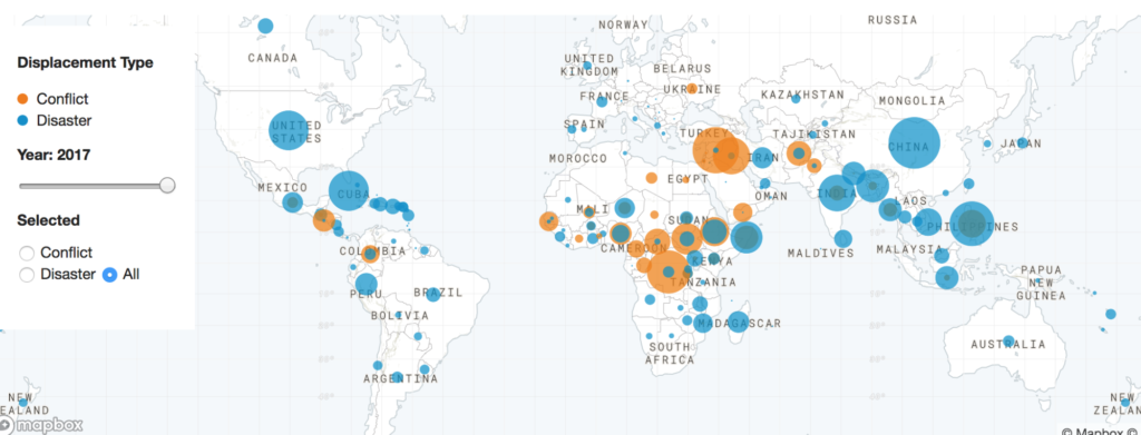
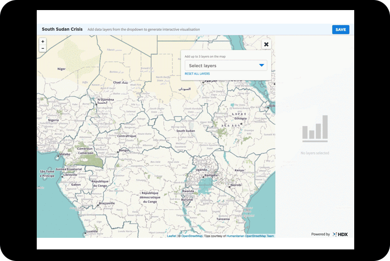
Interactive map used in the datastory ‘A Decade of Internal Displacement’
Several open-sourced tools were tested for the base maps, including Kepler and Leaflet. For analysis and graphics, I used R program and played with Datawrapper and ai2html to prototype and visualize. I chose open source because these tools are well developed and free to use, and their potential has been tested in the data visualization community. Moreover, I wanted to show the Centre and its partners how these tools could be utilized to support data storytelling in the sector.
During the ‘Crisis Lab’ exercise that we completed in the third week of the fellowship, the idea of following an internally displaced family’s movement emerged. Laith Ulaby, the User Experience Research Fellow, proposed the concept of ‘step counting’ from popular fitness trackers to calculate the distance covered by a displaced family, thus making it easier for some readers to relate to the situation.
This concept turned out to be the second focus of my fellowship: exploring how to use data and illustrate a typical displacement route for a South Sudanese family. In the newsroom, this type of story is called immersive storytelling, where users can interact with visuals and data as they explore the issue. The process to build it often includes a diverse team of reporters, editors, designers and developers, but the workflow was different in this case.
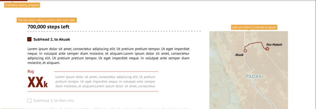
An early stage mock-up of the journey map of a displaced family in South Sudan
Since we don’t have reporters in the field, I did my own data and context research to understand the situation in South Sudan. OCHA’s South Sudan office provided ongoing feedback to the concept and edits to the story text. The initial route was revised to focus only on internal displacement rather than having the family cross the border into Uganda and become refugees.
For the data and design part, I used open-source tools geojson.io and QGIS to draw and edit routes; Mapbox for base map design; and Sketch for interaction and page prototypes.
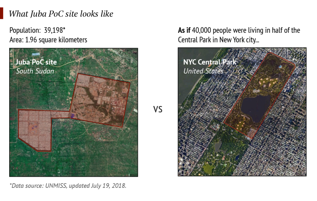
A graphic for one segment of the journey comparing the size and population of an internal displacement camp with an area of Central Park.
The journey of the South Sudanese family is divided into several segments to show the threats and relief they encounter along the way. At the end of my fellowship, an initial prototype was handed over to the Centre for web development. It will be launched as part of a public campaign later this year.
My fellowship included frustrations, learnings, sidewalks and joy, but it was by no means a predictable path or a simple ‘struggle, learn, happy ending’ arc. ‘Aha’ moments came, and soon were followed with more work and learnings. I became more aware of data gaps within the humanitarian sector, and I think process optimization will be as important as data quality improvement for producing data stories in the future.
Read the rest of the blogs by the 2018 Data Fellows, including their work on predictive analytics, data science and user experience research. Learn more about the programme from Senior Data Fellow Stuart Campo in Part 1 and Part 2 of his summary posts. Plus, watch the Data Fellows summary video here.