Quick Charts Tutorial
Now that you understand how the HXL standard works and how to use the core hashtags and attributes to tag humanitarian data, you can read this tutorial to learn how to prepare your data so that HDX will generate Quick Charts automatically when you share your data on the platform, and how to customize the charts afterward.
Tutorial
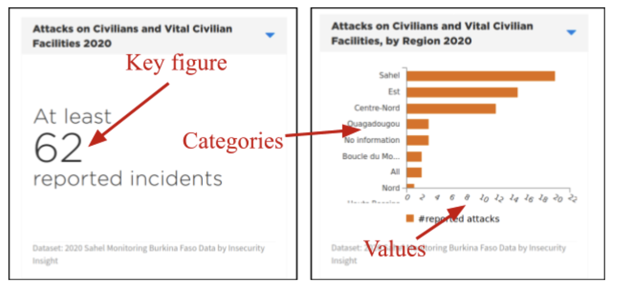
Thousands of datasets on the Humanitarian Data Exchange (HDX) come with three-panel preview graphs called “Quick Charts,” allowing users to see key insights from the data before downloading. The application automatically generates basic charts and figures from datasets that include Humanitarian Exchange Language (HXL) tags. Both data contributors and data users can customize these charts to highlight the insights in the data.

Start by HXLating Your Data
Quick Charts take advantage of the Humanitarian Exchange Language (HXL), which defines hashtags to identify data columns. HXL hashtags go into their own, additional header row so your existing headers do not have to change.
To add HXL hashtags (and Quick Charts) to your dataset, first add a new empty row to your dataset between the last row of your existing headers and the first row of data values.

In this new row, you add HXL hashtags. You need to add HXL hashtags only to the columns you want to be visualized but you are encouraged to tag other columns. For example, if you want to be able to visualise the number of people affected by a crisis or event, you can add #affected above the appropriate column in the hashtag row.
Choosing your Hashtags
Quick Charts typically include categories on one axis and values on another. Key figures let you highlight individual values, like the total number of people in need. These are some of the most-common hashtags for use in visualisations, but there are many more in the HXL hashtag dictionary.

Popular hashtags for the category axis
For humanitarian data, the most-common categories are dates or locations. For any columns containing these, you can place one of the following hashtags on top:
| Dates | |
|---|---|
| #date | Dates in general |
| #date+month | Months (“01”, “Jan”, “January”, etc.) | #date+year | Years (“2020”) |
| Locations | |
|---|---|
| #country | Countries or country-like entities |
| #adm1 | Administrative level-one subdivisions (e.g. provinces) |
| #adm2 | Administrative level-two subdivisions (e.g. districts) |
| #adm3 | Administrative level-three subdivisions (e.g. subdistricts) |
| #loc | Non-administrative locations (e.g. camps) or a mixture of different location types. |
| Humanitarian Responders | |
|---|---|
| #sector | Humanitarian sector or cluster |
| #org | Humanitarian organisation (in general) |
| #org+funder | Donor |
| #org+impl | Implementing Partner |
Popular hashtags for the value axis (or key figures)
The values in your dataset may be numbers (like the number of people affected by a crisis) or distinct items to be counted (like organisation names). Here are some of the hashtags you might place over value columns that you want to chart.
| Numbers of People or Households | |
|---|---|
| #population | Total numbers of people or households #affected: Just those affected by the crisis |
| #inneed | Just those in need of assistance |
| Cash Programming | |
|---|---|
| #value | A monetary value (e.g. for financing or cash programming) |
| #modality | A delivery modality (e.g. vouchers vs cash) |
| Infrastructure | |
|---|---|
| #loc+type | Types of infrastructure (facilities, hospitals, roads, etc) |
| #status | Conditions/status of infrastructure |
| #capacity | Capacity labels for infrastructure |
| Security events | |
|---|---|
| #event+type | Types of events (facilities, hospitals, roads, etc) |
| #group+type | Types of actors (e.g. militias) |
Putting it all together
Here is a simple dataset listing security events and the number of people affected by each.
| Month | Province | Event Type | Number Affected |
|---|---|---|---|
| 2020-08 | Coast Province | Attack | 3 |
| 2020-09 | Capital Province | Kidnapping | 2 | 2020-09 | Coast Province | Attack | 7 |
To use Quick Charts, you first need to insert an empty row between the headers and the data.
| Month | Province | Event Type | Number Affected |
|---|---|---|---|
| 2020-08 | Coast Province | Attack | 3 |
| 2020-09 | Capital Province | Kidnapping | 2 | 2020-09 | Coast Province | Attack | 7 |
Next, you will need to decide what categories and values you want to be able to display in your Quick Charts. While it’s not necessary to add hashtags to all of the columns, we’ll do so in this case because the dataset is small. Looking up the common hashtags from the tables above, we’d end up with this.
| Month | Province | Event Type | Number Affected |
|---|---|---|---|
| #date+month | #adm1 | #event+type | #affected |
| 2020-08 | Coast Province | Attack | 3 |
| 2020-09 | Capital Province | Kidnapping | 2 | 2020-09 | Coast Province | Attack | 7 |
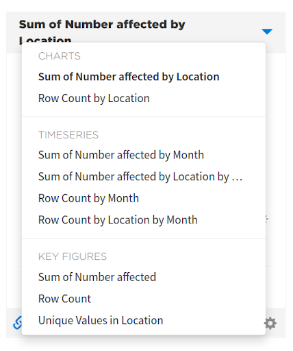
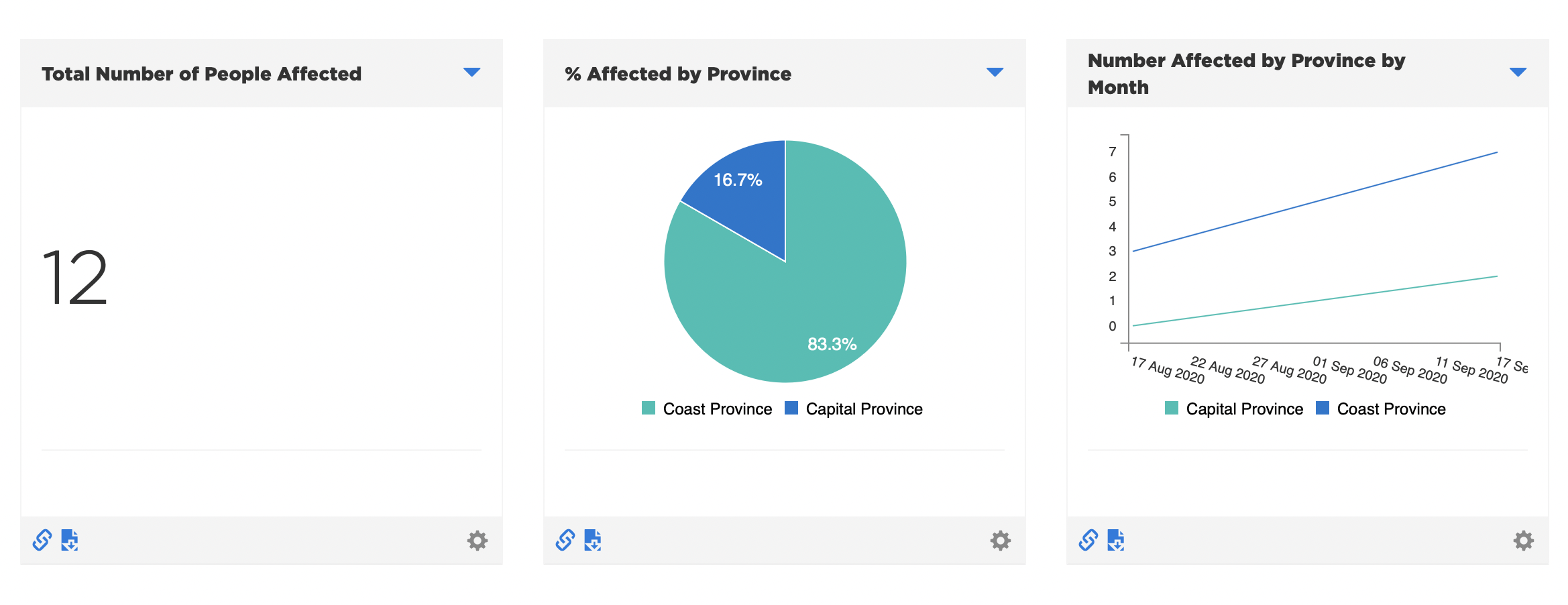
After you share this data on HDX, HDX will add Quick Charts automatically, then let you change them by choosing from a list of alternative charts. In some cases, the available charts might not be suitable; in that case, you can select the gear icon at the top right, enable “Recipe controls”, and then choose from a list of themes.
In this case, we will choose “Generic”:

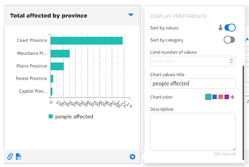
Now, we can choose a chart for each of the three panels, and then customise titles, colours, labels, and descriptions:


If you have permission to modify the dataset, after changing the chart types, you have the option to save them so that they become the default next time.

Going further with HXL and Quick Charts
HXL has many more hashtags and attributes than the ones listed above— to choose the right hashtags and attributes you can you the HXL Hashtag Chooser, or read through the official HXL Hashtag Dictionary. Quick Charts doesn’t take advantage of all of them yet, but if your organisation has a special need, let the HDX team know, and we can look into extending our “recipes”.
If you’re interested in doing more-sophisticated charts than Quick Charts supports, you might want to take a look at the British Red Cross’s HXL Dash, which supports more visualisation types and layouts, and lets you build a dashboard from HXLated data in a few minutes.
Finally, HXL isn’t just (or even primarily) for making charts. The HXL Proxy Wiki gives a taste of the different things you can do with HXLated data, including filtering, transforming, and combining it with other online data.
If you have any questions about HXL or Quick Charts, please send us a note at centrehumdata@un.org and we’ll be happy to help.