Share
HDX has released a new tool called Quick Charts. The application automatically generates basic charts and figures from datasets that include Humanitarian Exchange Language (HXL) tags. Both data contributors and data users can customize these charts to explore the insights in the data.
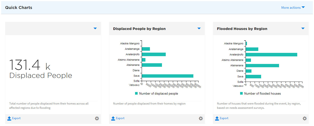
Quick Charts in action: Needs assessment data for Cyclone Enawo.
Data contributors can follow these steps to enable Quick Charts:
- Click the Add Data button.
- Add a resource with HXL tags. The resource can be an uploaded file, a link to a file in Dropbox or Google Drive, or an output from an API.
- Make sure the dataset is public on HDX. Quick Charts is not yet available on private datasets.
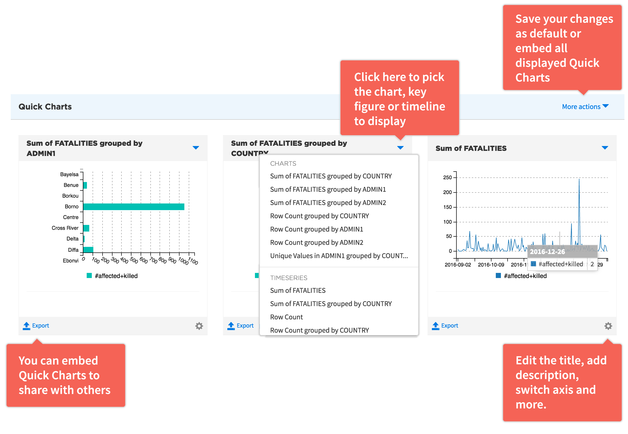
- Choose the charts to be presented on the dataset page. The charts are live, so whenever the data is updated, the charts will update as well.
- Configure the charts by changing titles and axis labels, adding text before and after key figures, and adding descriptions. Save the changes and this will become the default view on the dataset page.
Data users can do the following with Quick Charts:
- Select different charts to highlight aspects of the data you are interested in.
- Customize the charts by changing titles and axis labels, adding text before and after key figures, and adding descriptions.
- Embed the customized charts elsewhere.
If you want to explore Quick Charts further, take a look at this dataset on flood damage, or this one on health infrastructure.
Easier and Faster Data Processing
Quick Charts is the first in a series of HXL-supported tools that we will be releasing in the coming months. We conducted a survey in June that asked users for feedback on the proposed toolset. In addition to Quick Charts, the tools included: 1) HXL Assist, a module with step-by-step prompts for adding HXL tags; 2) Data Check, a spell-check for data; 3) Data Remix, a way to combine multiple datasets into one; and 4) Quick Maps, the ability to layer many datasets on a map. We will share the results of the survey in a subsequent blog.
The overall goal is to make it easier to create insight from data and faster to combine data from different sources. The large number of independent actors in a crisis, each compiling data using different methods, makes this difficult. We see adding HXL tags as a critical first step to improving data cleaning, validation, aggregation, and visualization. We hope that Quick Charts offers an incentive to adding the tags and that we can build on this to show the value of standards and interoperability more broadly.
Next Steps and Feedback
We are eager to hear what you think, and to see how we can to make improvements to encourage further adoption. In the future, we plan to make the API behind Quick Charts available outside of the HDX platform so that visualizing HXL-tagged datasets can be done anywhere. Your ideas and feedback are welcome at hdx@un.org.