Share
As the 2020 Statistics Data Fellow with the Centre, I explored the mosaic effect in the context of humanitarian data. In July, the Centre provided an introduction to this topic which included a literature review and a network analysis of data from one humanitarian response context. Here, I present the outcomes of my fellowship and offer recommendations for how the Centre and its partners can continue exploring and solving the mosaic effect.
What is the mosaic effect?
The mosaic effect occurs when ‘disparate items of information… take on added significance when combined with other items of information.’1 It is easy to see how this is analogous to a mosaic: pieces of seemingly unremarkable broken glass can be placed together to form a clear picture. But with my background in mathematics, I can’t help but draw parallels between the mosaic effect and formal logic.
Consider the following puzzle taken from Lewis Carroll’s lesser-known text on Symbolic Logic. Read the following three sentences and come up with a conclusion.
- All puddings are nice.
- This dish is a pudding.
- No nice things are wholesome.

From these three statements we can say that this dish is not wholesome. While this may seem a bit nonsensical, discovering something new is also the goal of someone trying to find the mosaic effect in humanitarian data.
The amount of humanitarian data shared publicly has increased dramatically in recent years. The Humanitarian Data Exchange (HDX) brings together large amounts of data contributed by dozens of organisations through one easily accessible platform. At its launch in 2014, HDX held around 900 datasets. As of September 2020, that number is closer to 20,000 datasets, with data covering every humanitarian crisis in the world and accessed by an average of 100,000 people a month.
Having the right data at the right time in a humanitarian crisis can mean the difference between life and death. But this does not come without risk.
Consider the following example:
- Three residents of a refugee camp are aged 70 or older.
- All camp residents 65 or older are Muslim.
- The oldest male resident is aged 60 – 64 years old.
Following a similar logic to the puzzle above, we discover that the three eldest residents of the refugee camp are Muslim women. This example demonstrates how three pieces of seemingly anonymous aggregate data can be pieced together to reveal new, sensitive insights, compromising data confidentiality and potentially the safety and wellbeing of those involved.
The recent increase in the generation and sharing of data must be accompanied by an increased effort to better understand and mitigate the potential risks posed by the mosaic effect. The broad aim of my fellowship was to better understand the likelihood and potential impact of the mosaic effect within the humanitarian context.
Building a Data Environment Mapping Tool
Understanding the data environment is a key step to assessing the likelihood of the mosaic effect arising for a given dataset. Through my fellowship, I developed a prototype Data Environment Mapping Tool to help the Centre and its partners do this more easily. By identifying potentially related datasets available on HDX, this tool automates much of the first step toward understanding the data environment in a specific crisis.
The tool uses a network graph to visualise all data related to a particular country and/or tag on HDX and the variables they share. Each node (a dot) represents one dataset and an edge (a line) between two nodes indicates if they have variables (column headers or HXL hashtags) in common. When the user adds a dataset to the tool, the dataset appears in the network as a new red node, revealing all datasets represented in the network with shared variables. These related datasets can be seen by hovering over nodes in the network but also appear as a list on the left side of the interface.
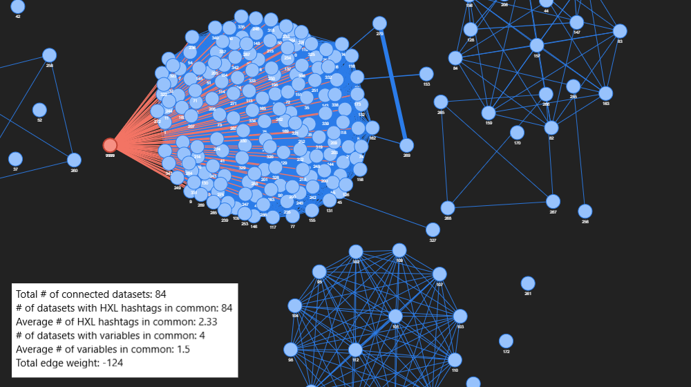
The tool identifies potentially related datasets by finding shared variables, which are crucial to understanding the data environment as these can be used to ‘link’ the data. The network graph was created in Python using the NetworkX package and visualised with the pyvis library and the user interface was built using the Dash framework. The source code can be found here. I hope that with further development this tool can be used by humanitarians to begin exploring the mosaic effect and how it relates to their data.
Exploring Data Linkages in a Specific Context
Since the Data Environment Mapping Tool only considers metadata (e.g. variable names) not the data itself, I also conducted a deep dive into a small number of datasets in an attempt to discover new insights by linking records within the data. I chose to focus on microdata from household surveys related to a particular humanitarian context. Although there is limited data of this kind available publicly on HDX, I felt I was more likely to find links within these datasets and that such data posed a greater risk of disclosure through the mosaic effect.
Using the open source software, Python Record Linkage Toolkit, I identified a number of links between records, very likely referring to the same household. While common variables were used to link the records, each dataset also contained unique information. By linking these records, I learnt more information about each household than could be found in either dataset alone, revealing combinations of information that could lead to disclosure of sensitive information.
In her paper titled Simple Demographics Often Identify People Uniquely, Latanya Sweeney, the founder and director of Harvard’s Data Privacy Lab, famously revealed that 87% of the U.S. population can be uniquely identified by the combination of their gender, date of birth and zip code alone. While there is still much more work to be done to better understand the mosaic effect in the humanitarian space, the findings of my fellowship suggest it poses a real risk to data confidentiality.
Continuing to Explore the Mosaic Effect
My efforts have merely scratched the surface of this complex and dynamic topic. The arguments for easily accessible data within this sector cannot be disputed, but I hope the outcomes of my fellowship have demonstrated that ensuring data confidentiality is not as straightforward as it may seem. It is impossible to know if malicious actors are using these techniques to reveal sensitive information from the data, but there are known examples of benevolent actors from other sectors revealing highly sensitive information from seemingly anonymised data through the mosaic effect.
While the Centre is well positioned to provide guidance on data responsibility, it cannot assess or mitigate the risks posed by the mosaic effect alone. A collective effort within the sector is required. I hope the outcomes of my fellowship encourage the Centre and its partners to continue the exploration.
My specific recommendations for the Centre and the sector are as follows:
- Further develop the prototype Data Environment Mapping Tool to increase its flexibility and applicability;
- Encourage humanitarians to consider, invest in and explore approaches for assessing the risks posed by the mosaic effect in their own data and share their learnings with others in the sector;
- Investigate the likelihood of a malicious attack on humanitarian data through the mosaic effect by conducting additional case studies or ‘deep dives’ into the data available;
- Better understand the utility of data published on HDX, particularly higher risk datasets such as household surveys, to better manage the risk-utility trade-off;
- Regularly revisit the literature and continue to reach out to other organisations responsible for data to learn how they are addressing these challenges.
View Carol’s slides from the Data Fellows Programme Showcase.
* * * * *
Learn more about the 2020 Data Fellows Programme and watch the video of the Data Fellows Programme Showcase. The new roles for our 2021 programme will be announced in February or March 2021.
1 Pozen, D. E. (2005). The mosaic theory, national security, and the freedom of information act. Yale LJ, 115, 628.